
Minimalist Art Explained: Transform Your Walls Today
Key Takeaways
- Minimalist art reduces form to essentials: simple geometry, repetition, and industrial materials, so “what you see is what you see”;
- The movement emerged in the late 1950s to 60s in New York as a reaction to Abstract Expressionism, influenced by Constructivism, De Stijl, and the Bauhaus;
- Icons like Frank Stella, Donald Judd, Agnes Martin, Sol LeWitt, Dan Flavin, Carl Andre, and Robert Morris emphasized material, space, and viewer experience over symbolism;
- You can bring minimalist calm home with clean grids, neutral palettes, and negative space, made easy with Mixtiles adhesive, repositionable frames.
Minimalist art strips everything to the essentials: line, color, form, and space. Born in the 1960s, it challenged the idea that art must tell a story or mirror emotion. Instead, minimalism asks you to focus on what is physically in front of you: the materials, the geometry, the light. In this guide, you will learn what is minimalist art, how it started, what defines it, who shaped it, and how to bring its serene clarity to your walls at home, effortlessly, with Mixtiles.
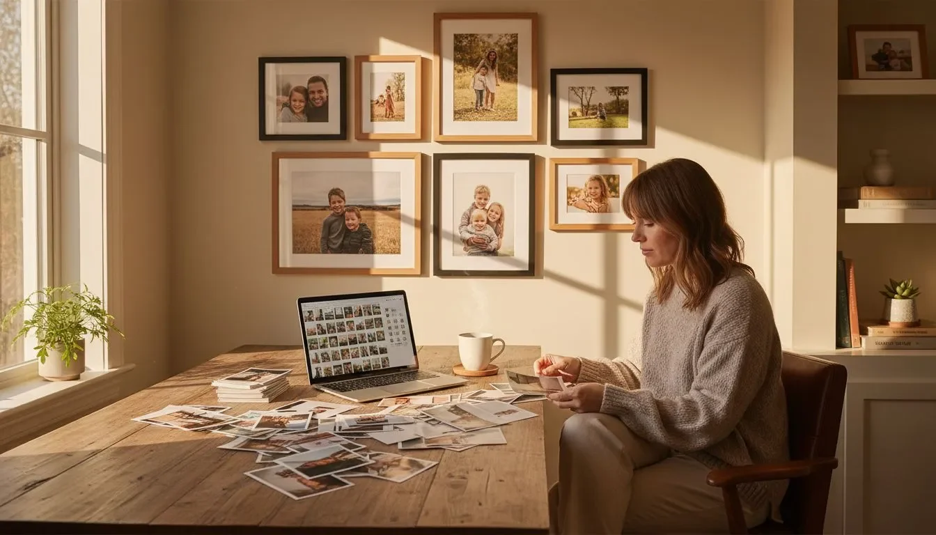
Create a minimalist gallery wall in minutes. Upload your photos to design your custom photo tiles, choose a clean frame style, and arrange a sleek grid. No nails needed thanks to our adhesive, repositionable frames.
What is minimalist art, really?
Minimalist art is a modern art movement that reduces a work of art to its main elements, often geometric forms and neutral surfaces, inviting you to experience the object as it is. It favors clarity over narrative, material over metaphor, and direct perception over interpretation.
Critics sometimes call it literalist art because the focus is the work itself. Frank Stella summed it up: “What you see is what you see.” Unlike abstract expressionism, with its gestural brushwork and emotion, minimalist artists remove personal handwork to let materials, scale, light, and space do the speaking. Whether painting, sculpture, or light installation, the result is a calm, ordered field that you simply stand before and experience.
How did minimalist art emerge in the 1960s?
Minimalism took shape in late 1950s New York, then spread in the 1960s and 1970s through galleries and museum shows. It grew from a new wave of influences and a pushback against expressive modern painting.
Artists reacted to Abstract Expressionism and drew on earlier movements like Russian Constructivism, De Stijl, and the Bauhaus. These precedents emphasized geometric shapes, systems, and industrial materials. Key moments included the 1966 Primary Structures exhibition and essays like Donald Judd’s “Specific Objects,” which challenged old boundaries between painting and sculpture. By the early 1970s, minimalism was a dominant force in the art world, fueling new directions in design and architecture as well.
What are the defining characteristics of minimalist art?
Minimalism is recognizable by its reduction and clarity. The form is pared back to help you notice materials, edges, light, and the surrounding space with no distractions.
Forms and materials
Minimalist works of art use simple geometric forms and geometric shapes, often repeated or modular. Artists adopted industrial materials like steel, aluminum, plexiglass, concrete, and fluorescent tubes. This shift was intentional: industrial materials reduce the trace of the artist’s hand and foreground the object’s physical reality.
Composition and process
Expect repetition, equality of parts, and limited or monochrome palettes. Neutral, even surfaces are common, as are black or white fields. The process may involve fabrication rather than studio handwork, reinforcing the goal of objecthood over expression.
Space and perception
Scale and placement shape your experience. A floor piece by Carl Andre or a mirrored cube by Robert Morris makes you navigate space differently. Dan Flavin’s fluorescent light washes turn light into material, transforming rooms into colored volumes you can feel.
Intent
The main aim is clarity and honesty of materials. Minimalist artists seek anonymity over authorship and prioritize truth to materials over storytelling. The result is a direct, physical encounter with the work.
Who are the key minimalist artists to know?
Several minimalist artists defined the movement in New York and beyond, each using materials and systems to reshape how we see.
Frank Stella
Known for the Black Paintings and the mantra above, Stella rejected gesture and created crisp, shaped canvases that asserted painting as object.
Donald Judd
Judd’s “specific objects,” including his famous wall stacks, use industrial fabrication to explore color, space, and repetition without illusion.
Agnes Martin
Agnes Martin, often simply Martin in scholarship, pursued subtle grids and lines that feel meditative and precise, a quiet counterpoint within minimalism.
Sol LeWitt
Sol LeWitt treated ideas as art, using modular cubes and written instructions. LeWitt’s systems turned seriality and structure into beauty.
Dan Flavin
Flavin worked with standard fluorescent tubes to sculpt light and color, redefining sculpture as a luminous, spatial experience.
Carl Andre and Robert Morris
Andre’s floor sculptures and Morris’s mirrored cubes and essays centered viewer movement and perception, shaping the phenomenology of minimalist work.
Bring minimalist calm to your space with a precise grid of Mixtiles. Start with 6 to 9 tiles, pick a minimal frame, and align them with equal spacing for a gallery ready look. Our custom canvas prints are perfect for a matte, textured finish you can reposition anytime.
Why does minimalist art still matter today?
Minimalism still influences modern design, interiors, branding, and contemporary photography because it clarifies what matters. Clean lines and geometric forms reduce visual noise, so a room feels calm and intentional. Museums continue to show these works of art because they changed how viewers engage with space. At home, the same principles help you edit, simplify, and curate photo walls that highlight your life and let you breathe.
How can you bring minimalist art into your home?

Start with a cohesive palette, then design for breathing room. Keep frames simple and finishes matte, and think in grids or aligned rows for instant order.
Start with a simple palette
Black and white always works. You can also try a two tone scheme, such as warm neutrals with a single accent. Consistency creates harmony.
Embrace negative space
Let margins and wall space surround each piece. Fewer elements make a bigger statement, and your eye can rest between works.
Choose clean layouts
Use grids or single rows for clarity. Equal spacing and alignment are your best friends in a minimalist layout.
Materials and finishes
Choose simple frame styles and matte prints. Mixtiles Fine Art Prints and Canvas Prints keep reflections low and lines crisp.
For a deeper dive into pared back styling across rooms, explore our minimalist home decor tips.
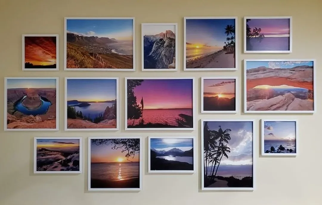
Which photo subjects work best for minimalist wall art?
Abstract, architectural, and nature details translate beautifully because they highlight line, texture, and light without clutter.
Subject ideas
Try architectural lines, graphic shadows, a monochrome landscape at dawn, or macro textures like stone and fabric. Color fields also work: photograph a single painted wall or sky for pure hue.
Shooting tips, phone friendly
Seek symmetry and isolate one subject. Use soft natural light to avoid harsh contrast. Simplify backgrounds, then crop to emphasize geometric forms. You may convert to black and white to reduce distractions and focus on structure.
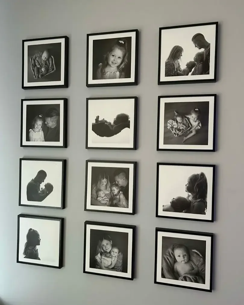
How do you arrange a minimalist gallery wall with Mixtiles?
Keep sizes and frames consistent, plan a simple grid, and use measured spacing. Mixtiles stick and restick, so you can fine tune the composition without tools.
For more layout formulas and spacing rules, see our guide on how to arrange art on a wall.
Recommended layouts
- 2 × 3 grid: Six tiles create a balanced rectangle that fits over desks or consoles;
- 3 × 3 grid: Nine tiles, like our 12x12 canvas prints, form a classic square for maximum symmetry on medium walls;
- Single row: Three to five tiles in a line for narrow hallways or above a headboard.
|
Advertised Size |
Actual Size (inches) |
Actual Size (cm) |
|---|---|---|
|
8 × 8 |
8.4 × 8.4 |
21.35 × 21.35 |
|
12 × 12 |
12.44 × 12.44 |
31.6 × 31.6 |
|
12 × 16 |
12.44 × 16.44 |
31.6 × 41.75 |
Not sure which dimensions will look best? Our wall art size guide compares proportions and viewing distances for every room.
Spacing and eye level
Leave 2 to 3 inches between tiles, then center the composition around 57 to 60 inches from the floor. This museum friendly rule works for most rooms and furniture scales. Learn more about how high to hang art on a wall based on ceiling height and surrounding furniture.
Mix and match, minimally
Limit frame styles and colors to one choice, and keep sizes consistent to reduce visual noise. If you prefer variety, change imagery rather than frames.
Quick setup steps
- Upload photos, then pick a minimal frame style;
- Choose quantity and preview a grid in the editor;
- Stick, level, and adjust as needed, Mixtiles restick cleanly.
Minimalist art invites you to slow down and notice form, light, and space, the pure essentials. From 1960s pioneers in New York to today’s interiors, its quiet power endures because it brings focus and calm. With a few smart choices in palette, subject, and layout, you can turn your walls into a serene statement. Mixtiles adhesive, repositionable frames make it simple to explore, refine, and live with the look you love.
Design the minimalist wall arts you will love. Open the Mixtiles app or start on our website, upload your photos, and build a clean grid that sticks in seconds, and moves when you do.
Frequently Asked Questions
How do you describe minimalist art in simple terms?
Minimalist art strips a work to essentials: line, shape, color, and space. It avoids narrative and visible gesture, focusing on materials, scale, and clarity. You engage the object directly, noticing form and light, rather than searching for symbolism or emotion.
What is the 70/30 rule, and how can it guide minimalist walls?
The 70/30 rule means 70 percent stays restrained, and 30 percent adds contrast. For minimalist walls, keep most elements neutral and consistent, then add a small accent. A tight Mixtiles grid with one subtle color pop or texture works beautifully.
Who are the most influential minimalist artists?
Frank Stella, Donald Judd, Agnes Martin, Sol LeWitt, Dan Flavin, Carl Andre, and Robert Morris are central figures. Their pared forms, industrial materials, and serial systems defined the movement and changed how viewers experience space.
Can a minimalist space help with focus and calm?
Many people find minimalist rooms reduce visual noise and feel calmer, which can support focus. Clean grids, negative space, and limited palettes create order at home. Curating a simple Mixtiles arrangement is an easy way to achieve that effect.
Be the first to know — deals, news & decor ideas.
By clicking you agree to the Terms of Use & Privacy Policy